IBM Blueprint
A set of iOS native building blocks geared toward medium-sized business owners arranged into a fully-featured retail app.
Summary
Blueprint is a set of solutions to problems that business verticals face in the mobile area, featuring a set of modular code blocks that can simply be copied into custom applications.
For this 12-week internship we chose to focus specifically on the retail vertical and on the iOS platform, but Blueprint is designed to be extensible to other areas as well.
My Role
As the sole designer on a team of 4 interns (2 software developers and 1 MBA), I was responsible for all of the research, UX design, and visual design for Blueprint. Design mentors on the IBM MobileFirst team ensured my work followed the IBM Design Thinking process. I kept constant channels of communication open with the developers as we followed an agile development flow.
Final Product
We demonstrated our modular code blocks in the form of a retail application for a fictional store called Amazing Apparel. There are two main applications: one for the customer and one for the store employee.
The customer will be able to order items through their iPhone app and the store employee will instantly be notified on their iPad through a push notification. The customer will then be able to pick up their order from the store through the app’s GPS capabilities.
Problem
Mid-sized retailers have a large problem: they don't have the resources necessary to create e-commerce apps that compete with the larger companies out there. For my summer internship at IBM Extreme Blue, we set off to solve this problem utilizing the IBM Bluemix mobile services.
Initial Research & Personas
Our team interviewed several subject matter experts (SMEs) in major industry verticals: automotive, retail, healthcare, and government. After brainstorming creative approaches to showcase the major features of Bluemix’s mobile services for each of these verticals, we ultimately settled with the retail industry.
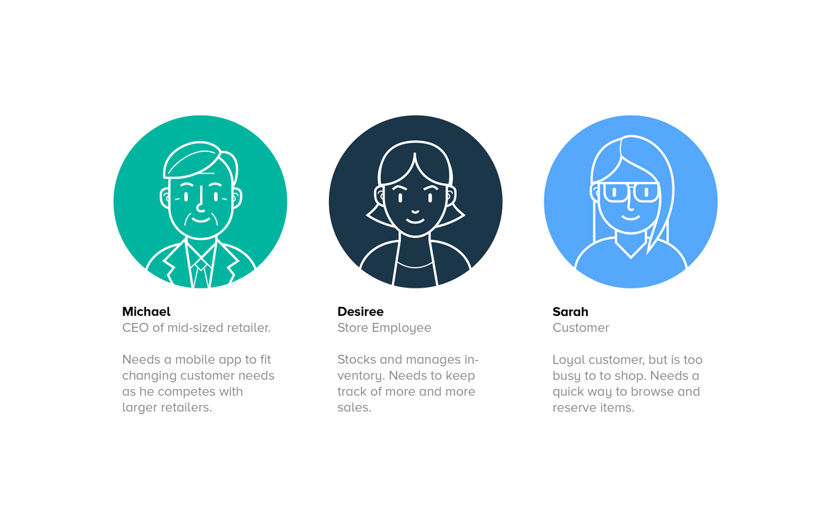
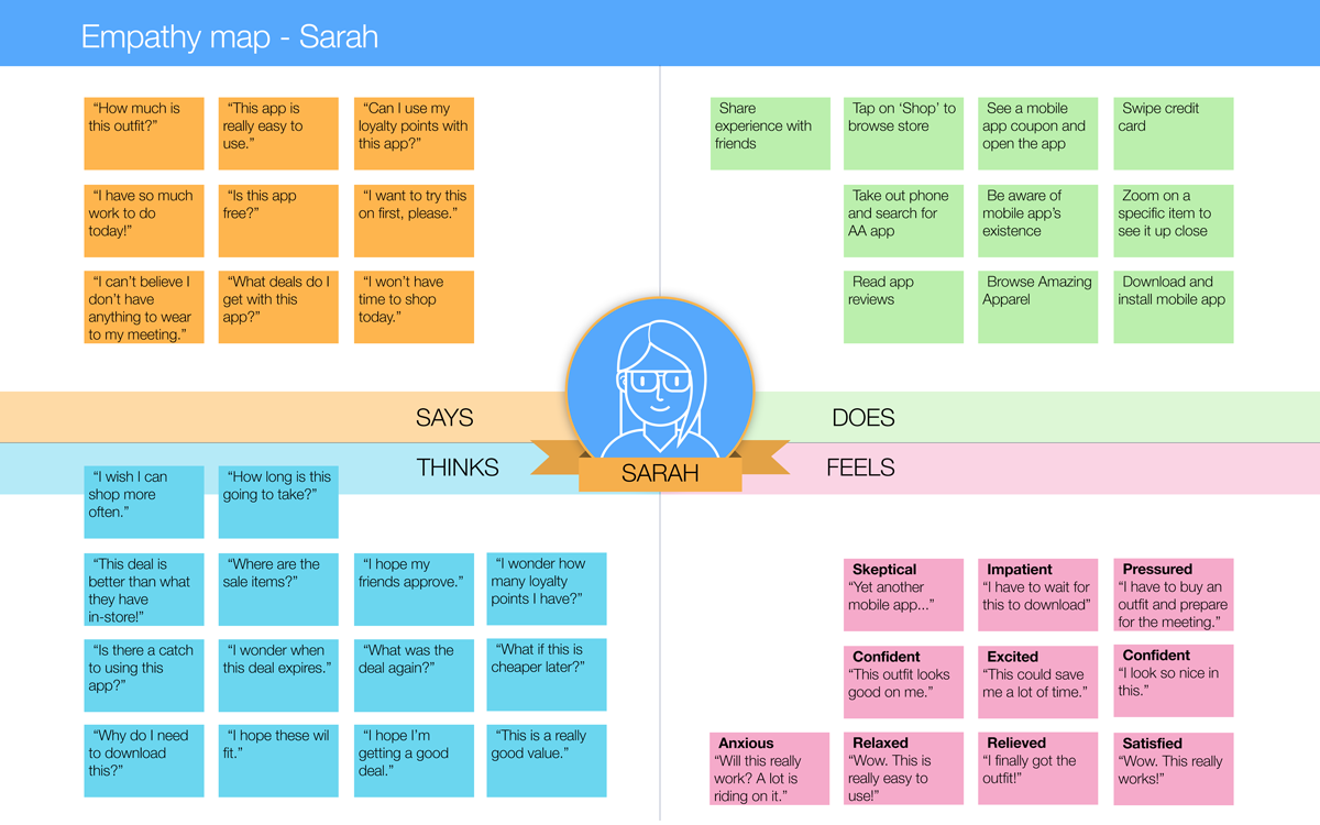
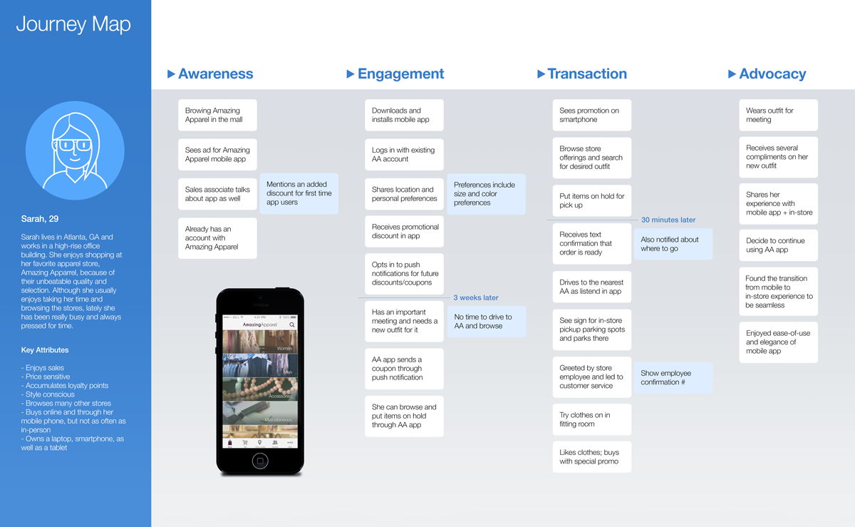
We then interviewed retail-focused internal SMEs, sales associates, and retail customers to define our personas and begin work on a clear user journey.


Initial Sketches
We focused on an app for Sarah, the customer, and her user journey. Initially our app was to be a storefront for a grocery store, but after the first round of testing we found that users were not keen on the idea of picking groceries through an app, and so we decided to focus on apparel.
Wireframes
I set about wireframing the distinct components of our sample customer-facing retail application in parallel with the developers on the team. We worked in one-week sprints, design always one week ahead of development to ensure a steady development flow. I created the medium-fidelity wireframes in Illustrator, progressing to high-fidelity screens in Photoshop as the weeks progressed, and finally to xCode storyboards for quick code integration.
Prototypes
The prototypes were ultimately built in xCode using Objective-C, and then deployed onto iOS devices.
I then set up usability testing in the form of unstructured thinkaloud sessions with five users of varying skill levels. They tested both the customer as well as the sales associate apps and provided valuable feedback on interactions, information design, and overall usability.
Presenting to Executives
At the end of the 12-week internship, my team and I had an opportunity to present our work to IBM executives, clients, and the IBM CEO herself, Ginni Rometty.
We set up a poster highlighting key features of the product, presented a quick pitch, and showcased working demos on both iPhone and iPad.


